Tommy Tomato
Animation — In collaboration with: Bernie van Vlijmen
Tommy Tomato is a social business dedicated to making nutritious hot lunches accessible to primary school students. As part of a broader campaign, we were tasked with creating an animation to introduce students to their lunch in a way that was both engaging and informative.
The world of Tommy Tomato is vibrant and full of character, featuring healthy and cool veggies like Pia Prei, Bo Broccoli, and Pammy Paprika. To make the animation engaging, we decided to give the narrator a distinct personality. What better narrator for a story about food than a character with a passion for eating? A mouth!
One of the challenges was designing a flexible "mouth template" that could handle every vowel and consonant, move dynamically, and change direction seamlessly. By leveraging After Effects’ JavaScript integration, we created a rig that was both versatile and efficient and able to bring the narrator to life! The final result was a colorful and engaging animation that introduced students to their meals in a way that was both fun and approachable.
This is Holland
Animation — In collaboration with: Sundaes.tv & Stolen Goods
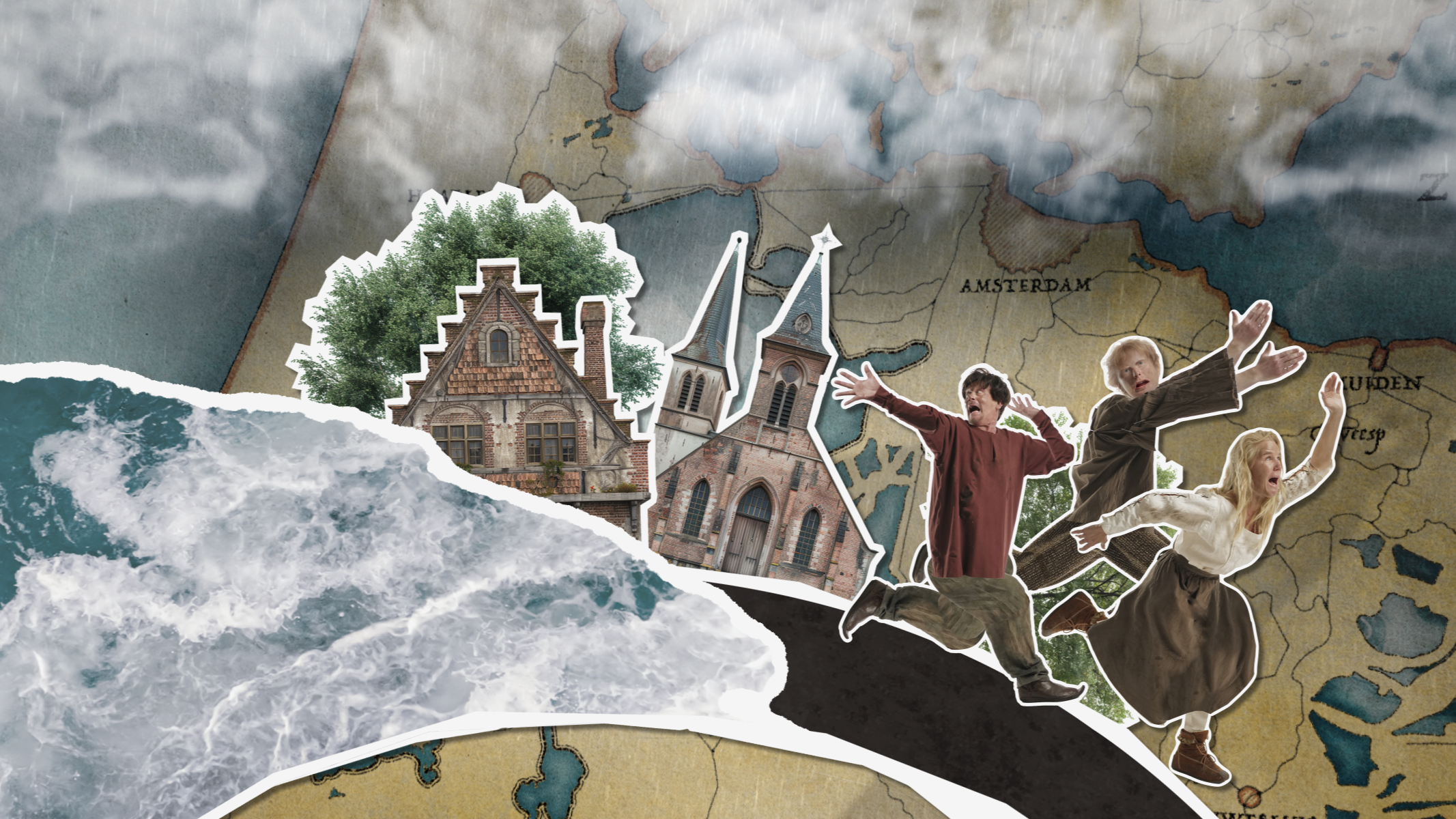
“This Is Holland” is an immersive attraction that gives visitors a unique perspective on the Netherlands. As part of an update to their introductory movie, we collaborated with sundaes.tv and Stolen Goods to illustrate and animate the country's ongoing battle against rising floods throughout history.

The client wanted an animation that integrated historical maps, illustrations, and live-action footage to depict the Netherlands' centuries-long battle against flooding.
We opted for a mixed-media approach, blending traditional illustrations with digital animation. The tone was educational yet visually dynamic, designed to engage a young audience. Our inspirations included historical cartography, archival materials, and contemporary motion graphics techniques.
One key challenge was redesigning historical maps to align with accurate GIS data, ensuring both authenticity and visual clarity. Additionally, animating these maps in a way that felt natural and fluid required careful planning.
The final result is informative yet approachable, aimed at helping visitors of all ages engage with the subject matter.


